
The Pioneer Newsletter #6
Monday, Oct 23rd

Introduction Paragraph

Friday morning. Two substances course through my veins - Coldplay and joe. I came into work with the grand realization that I possessed a $5 gift card to the local Coffee Bean. I found it last night in my desk. Shit. I might just have to use that tomorrow, I thought to myself before leaving the office. Large iced coffee, of course. Just Ben Affleck and I holding down the fort for large iced coffees while its crackhead uncle, medium cold brew, is all the rage these days. I wrote another intro last night so depressing, I won’t even share it with the cloud. But my free iced coffee, Chris Martin, and the dearth of emails in my inbox have allowed me to flip the mothafuckin script and take a good hard look at a few of my accomplishments with this very newsletter. Truth be told, six weeks is about five weeks longer than I expected this to go. Hold up. “Life in the Technicolor II” just started playing. Isn’t that the closing song of Night at the Museum 2: Battle of the Smithsonian? You know, when Amy Adams plays Amelia Earhart but then appears in modern times as I guess…sort of Amelia Earhart? Shoutout to you Shawn Levy. Keep making mediocre flicks. That shit’s harder than it looks. But anyways, this is my sixth newsletter and I’m damn proud of that. I’ve amassed over 50 subscribers, 1.1k hits on Substack, and most importantly over 2 occurrences of dudes dapping me up at bars followed by love the blog bro. This is what life’s all about. I’m on my Hank Moody shit. That Carrie Bradshaw nonsense. These numbers may pale in comparison to actual internet popularity but for me, they're monumental. Six weeks ago, it felt as if I was writing in a vacuum. Television scripts that couldn’t get past page 10. Feature scripts that couldn’t limp past 30. I wrote like I had everything to lose. The only letters I saw on the keyboard were F,A,I,L,U,R, and E. I realized how much more time I’d spent writing cover letters to get coffee than I did stories. So I decided to change course. I penned some words on the insane love triangle in Harrison Ford’s Witness. I broke down a Hinge date like I was on the Manningcast. I jumped into my Jon Taffer bag and complained about the loser bars in this town. It all just seemed too easy. You’re telling me all I had to do was *write*? Well shit. I guess I’ll just keep doing that. “Lovers in Japan” just finished. Goddamn if that song doesn't get me RIGHT. But before I break down the entire track list of Coldplay’s Viva La Vida and hopefully before I finish this entire large iced coffee, I’ll go ahead and sign off. My heart’s racing. My fingers are moving. And while I’m still at the same desk, working for the goddamn man, I suddenly feel like a writer once again.
P.S.
If you’ve been slacking on your reading, I’ve got the stats through the backend to prove it. So if you dap me up and say you love the blog - make sure it’s with your left.
Half-Baked Rant: UI, Silicon Valley, and the Sports Uniform

Maybe I should let this one cook in the oven a little longer. But hell, I’ve just got to get it off my conscience.
There’s a book I recently read and highly recommend titled User Friendly by Cliff Huang and Robert Fabricant. Well, I actually listened to User Friendly by Cliff Huang and Robert Fabricant. And I guess I can’t recommend the entire book because I myself have only listened to the first two chapters. But within these highly impactful first two chapters, Huang and Fabricant begin to track the advancements in user-interface design since the Industrial Revolution. Advanced machinery was once exclusively reserved for its respected experts. However events such as the second World War brought on the need to create technology, i.e. weapons and radar systems, that could be trained on and operated far more quickly. The lessons learned were further applied throughout the 1960s-70s with the development of personal computing. As Silicon Valley engineers worked to put an advanced thinking machine on everyone’s office desk and kitchen countertop, designers simultaneously worked to create buttons, lights, and screen graphics that could make the intimidating machines universally learnable. Obviously, UI design as well as technology has come a long way since then. We’re able to day trade whilst merging through four lanes of traffic. Your 11 year old nephew can steal your identity off an iPad and sell it to a broker in Hong Kong. Over the phone, I’m able to successfully explain to my father how to sign into HBO Max on his Fire Stick (so he can stream The West Wing). We work on screens every day - operating pieces of machinery very few of us could explain the inner-workings of. It’s through the incredible advancements in user-interface design that this is possible. Basic typefaces, bright colors, and icons - so simple they could be drawn by a child - are all design properties of the apps, websites, and system preferences we’ve mastered. It took some trial and error. At one point a paper clip named Clippy answered questions you had about Microsoft Office. However, now it all looks quite homogenous in a very effective way.
But I’m not interested in the current state of user-interface design so much as I am concerned about the unfortunate graphic design movement it has sparked. It all started with Silicon Valley adopting the clean and intuitive design pallets of its menus and paywalls for its own brand identity. Almost all tech companies rely on some form of two color and Helvetica typeface designs for their advertising and packaging. This makes sense. They are in the business of projecting the friendly user experience of their products and operating systems. But the largest and most influential companies in the world are technology companies and now suddenly just about everything around us is branded like the settings menu. Every design, both words and logos, are simple and easy to understand. The functional graphics that make our tech navigable have somehow euthanized creative design. For example, I attended Loyola Marymount University in Los Angeles. This was school seal my freshman year in 2017.

This is what it became by the time I graduated in 2021.

A 100 year old academic institution would like to portray itself as simple and easy to understand? I just don’t see the purpose of this. There’s no touch screen. I cannot tap on the lion’s face to launch Lion+.
This trend of UI design is just about everywhere. And while I have no beef with minimalism (minimalism and I go way back) - it is instead minimalistic graphic design without intention that particularly gets on my nerves. Stop signs are bright red and not written in cursive for a reason. My alma mater could be mistaken for a frozen yogurt shop because they failed to find one. Unfortunately, even at the highest levels of leadership, everyone seems to just be copying the tech bros up in the bay. Silicon Valley has brought us a great number of things. But they have undeniably ruined casual ski-wear (lame), the San Francisco bar scene (dong fest full of casual ski-wear), and the current era of popular graphic design.
But I could live with all of this. There is still great graphic art out in the world - if not within the brand identities of large companies and academic institutions. What I have trouble standing idly by for, is Silicon Valley’s influence on sports uniforms - a subject I will openly declare to be an obsession of mine. There was a point in my life in which I believed it was my calling to design American sports uniforms. This was until sponsorship patches were added. I wanted no part of that. But I still do my best to keep up.
There’s a sub-trend of uniforms I follow - increasingly elaborate “uniform release” content. What started as simple on-court photoshoots has now turned into smoke filled, strobe lit productions where the seventh man off the bench appears in the team’s new threads as if he has just time traveled from a dystopian society. The grand reveals are then always followed by a less grand press conference. Reporters ask the athletes, who are more concerned about their 10-day contracts rather than fashion (well I guess that’s up for debate nowadays), about the uniforms. The word clean is then uttered about 150 times. Why? Because they are clean. Most uniforms are in fact nothing but clean. The UI graphic design trend, which easily infected the dullness of corporate America, has now also infected professional sports. There is no intention behind the minimalistic uniforms we see peddled out in each sport. They may not be as basic as the icons on your home screen but they’re not far from it. Like most fast fashion, they’re safe enough to sell but indistinguishable enough to throw away. It all makes too much sense. Professional sports teams are increasingly owned by billionaires who made their riches on the internet. Steve Balmer, former CEO of Microsoft, bought the Clippers and literally stuck a logo on their uniforms that looks just like Clippy. So while I do not care about the logos of corporations or shell companies, I do care about my beloved uniforms, and the art is a sad state.
There are two essential design functions of the uniform. The first is color. This distinguishes the two teams apart. The second is each uniform’s individual number. This is for referees and statisticians to identify each player. Such minimal functionality has allowed for incredible creativity and beautiful design. Some are very simple and some are far more complicated. Some designs, so iconic and rooted in organizational identity, that they will forever stay the same. Think the Boston Celtics, New York Yankees, or Montreal Canadiens. But there are other teams that, for whatever reason, need a refresh. The teams used to turn to local artists. These local artists used to take swings - not all home runs - but swings nonetheless. Now, they turn to the guys in casual ski-wear who brought you the user terms of service agreement and sell garbage to the masses. Shield your eyes if you’re prone to vomiting.


Recs
Kickball (SPORT) - While you’re reading this evening, I’ll be at my rec league game. Kickball is like Drake and Josh - created for middle schoolers but loved by young adults everywhere.
Out of Sight (FILM) - I was shown Out of Sight in a college class. It completely altered my taste in movies. Every time I revisit it, including last Saturday at a 25th anniversary screening, I notice something new - in the performances, writing, and especially in its non-sequential editing. But above all else, I recommend it because it’ll just make you feel a little cooler. Clooney, JLo, Stevie Zahn, and Don Cheadle. Uh, yeah. Check please.
The Cinema Bar (BAR) -If you’re looking for a joint off Sepulveda where you can be you, look no further. The only place in town I’ll order Budweiser bottles (a.k.a. “Downbads”) and pay in cash.
Iced Coffee (BEVERAGE) - Affleck knows. I know. Now you know.

Conclusion Paragraph
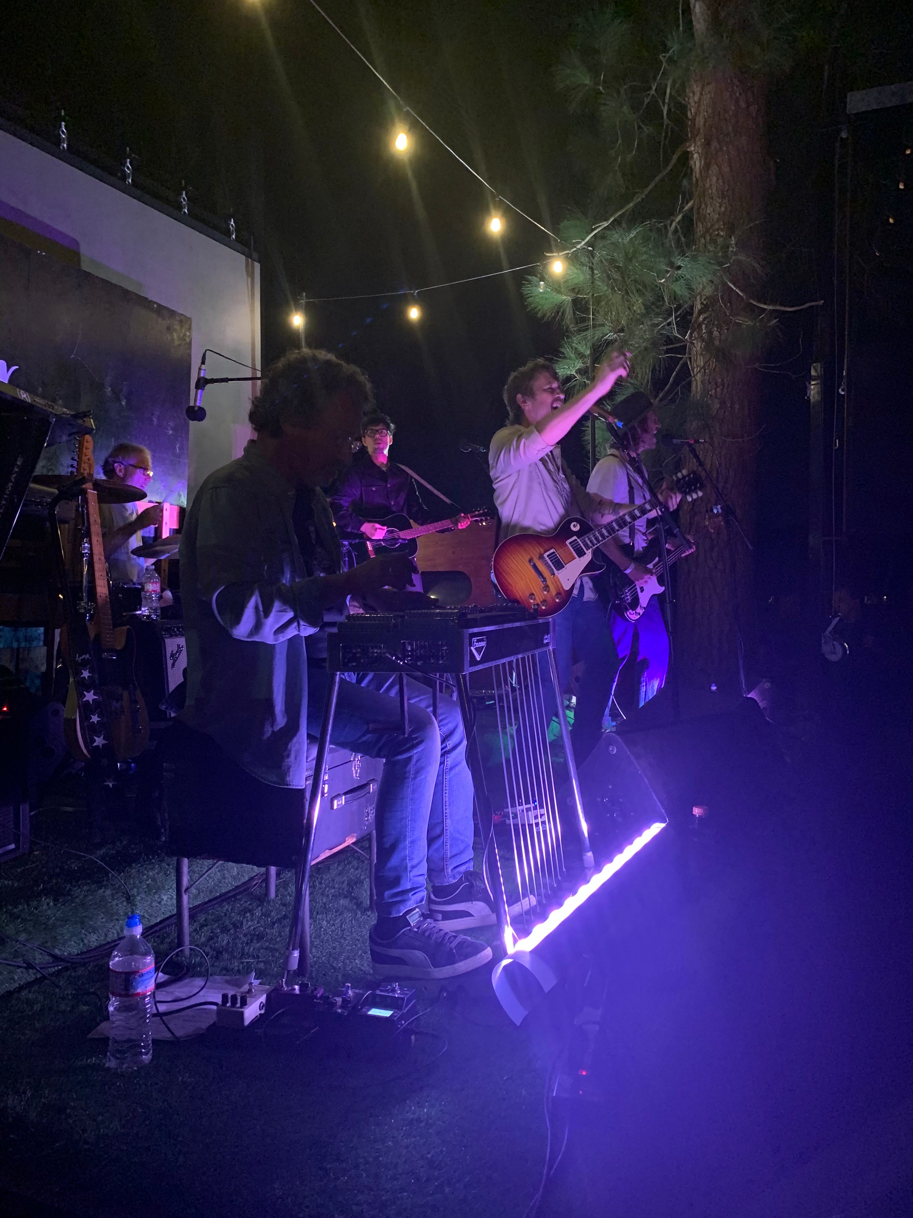
Let’s do all of the things we love. All of them. Let’s take home the hobby we just met at Target. Let’s devote 10 years to the banjo and then suddenly drop it for the DJ deck. Not because it’ll lead us anywhere fruitful but simply because we just want to do it. Let’s accept what makes us special doesn’t necessarily need to be our specialty. In a town where knowing your business plan comes before knowing what business you’re in, the purity of a hobby or passion project can quickly run dry. But not for my hero this week. I went to a concert Friday night. I was there to see Chris Shiflett. You may know him as the lead guitarist of the Foo Fighters. But he’s not my hero because he rocked out to My Hero or any other Foo Fighters song for that matter. I saw Chris Shiflett at The Penmar Golf Course in Venice. He played some tunes off his new surf rock album for a small crowd of picnics and lawn chairs. (Chris Collinsworth voice) Now here’s a guy who’s just out there doing it for the love of the game. He’s in the goddamn Foo Fighters. He’s played Wembley. He’ll be on SNL next week! But I witnessed him have an absolute blast playing music of his own on the putting green at 1. He’s made millions off t-shirts with Dave Grohl front and center, but last Friday, his teenage son sold “Shiff” shirts off a folding table next to the stage. Simply put, there was a purity to the show that was undeniable. A man who’s reached the top of one mountain, loving to hike another he may never summit (fuck that was good). So let’s go out there and just do all the goddamn things. Throw it all at the wall and see what sticks. For the love game - not hustle. Take it from my new hero, Shiff. We won’t become great at anything we aren’t willing to enjoy performing at a golf course just as much as anywhere else.
Matt Laniado aka Carrie Bradshaw